Shuhei Kagawa

Building a toy browser

Jun 3, 2022 - Browser, CSS, Python

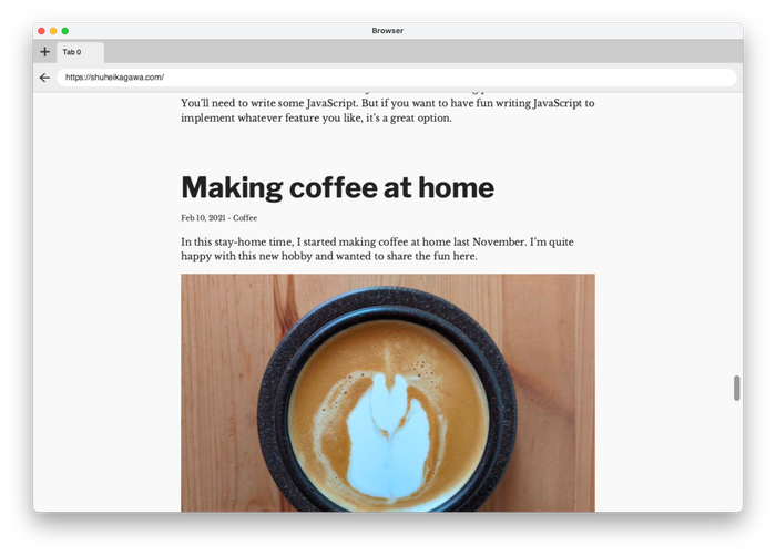
Screenshot of my toy browser showing this website

In the last several weeks, I have been building a toy browser based on an online book, Web Browser Engineering. As someone who spent a fair share of his career on web frontend, it was eye-opening and satisfying. It felt like I had been living on one side of a wall for years and finally visited the other side of the wall. I imagine other web frontend folks would like it as well.

The book

Web Browser Engineering is an online book by Pavel Panchekha and Chris Harrelson. It explains how browsers work and lets you implement a toy browser almost from scratch. HTTP, CSS parser, HTML parser, rendering pipeline (style, layout, paint), the interaction between browser window and tabs, JavaScript, animation, and the list goes on. It uses only a handful of libraries such as TCP, Tkinter (replaced by Skia and SDL in later chapters), and dukpy.

I discovered it on Twitter. Once I started reading the book, I was hooked. It presents succinct code to implement browser features incrementally. You are always with working code.

Each topic lays a good foundation that you can build upon and links to relevant resources. Exercises let you implement features on your own.

Even before the book, I had read a good amount of articles about how browsers work from outside. The book explained concepts in a way that readers could implement them. I learned a lot.

Beyond the book

I wanted to render real-world websites. Well, real-world websites on the simpler side. Not JavaScript-driven applications. HTML, CSS, and a bit of JavaScript. This website and the book's website were my main targets. Wikipedia was a stretch goal.

The goal has been partially achieved.

Even for rendering simple websites, I had to implement or revamp numerous browser features beyond the book.

HTML

I revamped the recursive descent HTML parser from the book to support quoted attributes, raw text elements, etc. Among HTML, CSS, and JavaScript (ECMAScript), the HTML spec was the easiest to read and implement (partially).

Fun facts:

CSS and rendering

I was drawn to implementing CSS features. CSS is more forgiving than JavaScript—at least for a toy browser. Even if my toy browser missed most of the CSS features, it still rendered something on the screen. On the other hand, JavaScript halts execution on a single missing syntax or feature. I would need to implement a bunch of browser APIs until the toy browser could run real-world scripts. So, I focused on CSS and rendering for the toy browser.

While I was working on the project, my best friends were MDN and CSS specs (CSS 2 and more). Yes, there are quite readable.

One surprise for me was that CSS syntax doesn’t say much about property values. Each property has own syntax. For example, font-family and animation have different precedence rules for commas and spaces.

font-family puts commas higher precedence than spaces:

/* (1.6em) (bold) (Helvetica, Arial, sans-serif) */
font-family: 1.6em bold Helvetica, Arial, sans-serif;

animation does the other way around:

/* (slidein 3s), (move 10s) */
animation: slidein 3s, move 10s;

The book skipped whitespace handling but it was necessary for nice-looking code blocks (white-space: pre). The CSS spec has elaborate rules for ignoring and collapsing whitespace. I made up a greedy algorithm instead of implementing the full spec. It's not 100% accurate, but it looks alright.
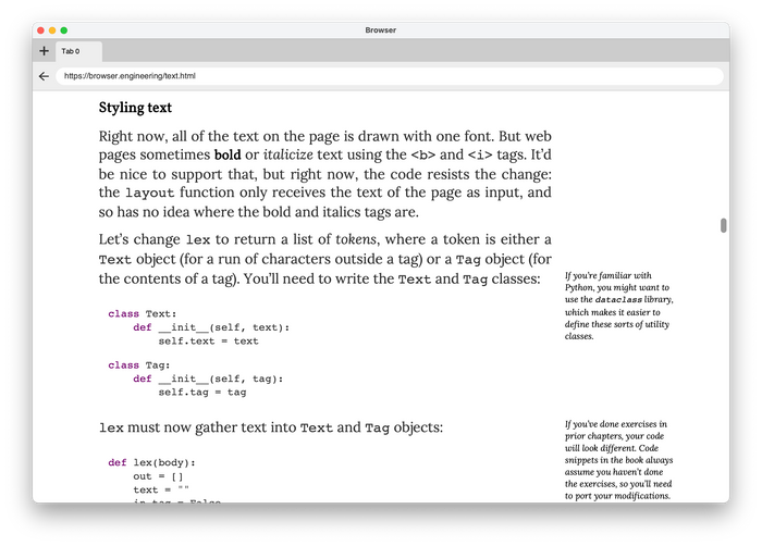
Screenshot of the toy browser showing a page with code blocks

Web fonts were essential to make my toy browser look nice. I revamped the CSS parser to support the @font-face rule and implemented rudimentary font synthesis and font matching. Skia took care of the actual rendering.

I also learned a few things about the inline layout (or normal flow). The box model is considered to be a basic for frontend developers. But did you know how the inline layout works? What's the difference between line-height: 1 and line-height: 1em? Why doesn't vertical-align help vertical centering? Deep dive CSS: font metrics, line-height and vertical-align by Vincent De Oliveira is an amazing article that explains those things.

Fun facts:

Other stuff

I also implemented other stuff.

  • Retina display to make the toy browser look good on my laptop
  • Window resizing: SDL doesn’t seem to provide a good API for resizing
  • URL parsing: Parsing URLs into objects made it easier to implement many other parts of the project. I should have done it earlier.
  • Content Security Policy: The CSP implementation from the book blocks legitimate requests. I implemented the bare minimum to allow legitimate resource loading.

Python

The book uses Python for good reasons. I followed the path and used Python because I wanted to focus on the subject instead of spending time on how to do X in Y language. I had already made enough (fun) mistakes of this kind in my life.

Also, it was a good opportunity for me to learn Python. Python is used in a lot of places now, but I had survived without learning it before the project. After writing thousands of lines, I like its concise syntax.

I used pyright for static type-checking along with coc-pyright on Vim. Its type inference worked quite well for me. It uses a gradual typing approach similar to TypeScript although Python’s type annotation is part of the language specification. Python’s typing features don’t look as powerful as TypeScript, but they met more than 90% of my needs. Also, auto-completion was helpful for a Python beginner.

My toy browser uses only a handful of third-party libraries. They either had type annotations or had only small little surface in my toy browser. The only exception was skia-python. I used it a lot. It didn’t have official type stubs, so I generated them with mypy's stubgen. The generated stubs were not perfect but good enough as a foundation to build upon for my limited use case.

I used black for code formatting and pytest for unit testing. I don't have much to say about them because they just worked™.

Conclusion

It’s been a fun side project with lots of learning. I imagine other web frontend folks would like it as well. I recommend you check out the book and build your own toy browser!

2021 in review

Dec 31, 2021 - Review

A view from a lift in Amden

I turned 40 this year. I've lived roughly half of my life—in a happy case. If time gets faster as we age, it'd be more than half. But 2021 didn't feel short to me, probably thanks to a lot of changes this year.

Move

My biggest event this year was the move to Switzerland. In December 2020, I started working remotely from Berlin for a team in Zürich. Then I flew into Zürich at the end of March and moved into my current apartment in June.

International moves are not easy, but everything felt three times harder during the pandemic. We terminated numerous contracts by letter/phone/email, packed books and furniture, gave away the rest, emptied the apartment in Berlin, and departed from the new BER airport. I didn't say goodbye in person to most of my friends in Berlin. We checked into a temporary apartment, found a long-term apartment, bought furniture piece by piece. We finally felt we settled down in the autumn.

Zürich

Sun and alps over the Limmat river and the Zürich lake

Zürich is small. Almost everything is within walking distance. It doesn't have as many trees and parks as Berlin does, but the Zürich lake and mountains are nearby. You can see snow-crowned alps across the lake. My biggest complaint is that most of the streets and sidewalks are covered with asphalt. They are good when you carry suitcases, but I don't like how they look.

People here seem to be early birds. Streets become noisy around 7 a.m., so I had to adjust myself to become an early bird. I go for a walk after 9 a.m., and parks and coffee shops are almost empty where I'd see more people in Berlin. On the other hand, cafes and bars get full of people enjoying apéro in the late afternoon, especially in summer.

It's expensive to eat out here—twice or more of Berlin. I haven't tried many because of the pandemic and the price. On the other hand, more Japanese groceries are available here. Also, I'm happy that supermarket chains sell sashimi-quality salmon and tuna. Especially, Migros' salmon is amazing.

Language

Even though Zürich is a German-speaking city, many people speak fluent English. It feels much easier to live here without speaking German than in Berlin. But this situation of no pressure somehow motivated me. I started learning German again with Duolingo.

I learned some Swiss-German phrases like merci vielmal meaning thank you very much. Such a nice expression of multilingualism. Also, I learned that the -li suffix was Swiss German. The most famous one would be muesli (Müsli), and some of you may know the compression algorithm Brotli (Brötli).

Travels

Matterhorn and its reflection on a lake

I got a new hobby, hiking. Well, I had to, because it's Switzerland. Starting from Uetliberg—Zürich's Hausberg—I hiked on Rigi, Pfannelstiel, Lägern, Pilatus, Zermatt, Amden, and Sihlwald.

The Swiss government provides an impressive map website/app called SwitzerlandMobility. It shows everything necessary for hiking and allows you to plan your next trip.

In addition to mountains, I visited several Swiss cities: Luzern, Rapperswil, Basel, Bern, Lugano, and Neuchâtel. They were all small and walkable. Before my move, I didn't know that there were many medieval towns in Switzerland. It was fun to walk through Switzerland, Germany, France, and Switzerland again in Basel.

I was able to travel a lot because Swiss transportation is great and the land is small. In terms of area, Switzerland is only 40% bigger than Brandenburg and half of Hokkaido.

Food and drinks

I've been exploring the famous Swiss Cheese. Emmentaler, Appenzeller, Gruyere, Vacherin, and so on. I learned that Parmigiano Reggiano was not necessarily the best cheese in the world.

Also, I almost stopped drinking alcohol, including beer. Instead, I've been practicing latte art and drinking coffee every day.

Social media

I'm trying to reduce my usage of social media. Sometime this year, I realized that I was spending more than 3 hours every day on Twitter. That was horrific. In addition, social media timelines show less and less content from my actual friends. They show recommendations and content that my friends liked. I tried to limit time first, but it didn't work. So, I just stopped using them altogether for a few months. It felt great. I got more time to read books and became attentive to what was going on around me.

Books

I bought roughly 60 books, read 12 of them, and half-read several more. I couldn't read much around the move but started picking up in the winter. I especially liked that Tyranny of Merit and Four Thousand Weeks made me step back and think about how to spend the rest of my life.

Work

It's been a year since I started my current job. It took me the whole year to feel comfortable with it. My managers told me I was doing fine, but I didn't feel I was catching up fast enough. The tech stack was completely new to me. It was hard to focus on work for the few months around the move. Imposter syndrome was real. Working from home didn't help here.

Fortunately, it gradually improved. I was able to focus again after settling down in my current apartment. I slowly felt belonged when I commuted to the office and met teammates in person. My starter project turned out to be more complex than I expected, but I'm happy that I finished it. I started getting some other responsibilities. There's still a long way to go, but now I feel I can do something.

Conclusions

In 2021, I moved to a new country, settled down at home and work, traveled a lot, and had some chance to step back and reflect. I'm looking forward to what's to come in 2022!

Cow on a field

New look

Feb 23, 2021 - Blog

I updated this website’s design and replaced its static site generator with Eleventy. Here are some notes about the new look and implementation details.

Design

I had used only sans-serif fonts on this website. Serif fonts felt too fancy. But I like serif fonts on paper books. Many of them use serif fonts regardless of the fanciness of their contents. I wanted to do so for my website as well. But I didn’t know which font to use. There are so many fonts in this world, and Google Fonts has tons of serif fonts. So, I used a type pairing from Typewolf—Libre Franklin for headings and Libre Baskerville for body text.

For code blocks, I chose DM Mono. DM Mono is a monospace font commissioned by Deep Mind—yes, they have their own fonts. Its “f” has a fancy touch. I use it for coding these days after years with Fira Code.

function greet(name) {
  return `Hello, ${name}!`;
}

This website has mostly text and a few images. Web fonts are the only luxury that I put.

Tech

I replaced my home-grown static site generator using gulp with Eleventy. I liked gulp—it was a good use case of Node.js streams. But I wanted to try something new. I picked Eleventy simply because I heard its name many times and it runs on Node.js, which has a large ecosystem of web tooling.

Also, I removed Disqus and Google Analytics. This website is almost free of cookies now. The last one standing is Cloudflare’s bot detection cookie, which will be removed in May 2021.

Implementation details

I took image optimization techniques from google/elventy-high-performance-blog—next-gen image formats (AVIF and WebP), multiple image sizes (srcset), blurred placeholders with SVG, immutable image URLs, aspect ratio by setting width and height, lazy loading and async decoding. The implementation is rather wild. It parses each full HTML with jsdom, finds <img> tags, read and optimize linked image files, and replaces the <img> tags with optimized <picture> elements.

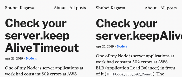
I implemented a funny feature that inserts <wbr> into longCamelCase words—like long<wbr>Camel<wbr>Case—to break them on small screens. Some posts on this website have long titles such as “Check your server.keepAliveTimeout.” Those titles overflow on small screens. I could use a smaller font size for the titles, but I wanted to use a big font. <wbr> HTML tag tells browsers that they can break lines there if necessary. I created a template filter to insert it.

Heading with  on the left and heading without it on the right

This website has a feature to generate Open Graph images—or Twitter Card images—using node-canvas for blog posts without any images. I used Eleventy’s pagination with size: 1 to implement it. It’s a cool way to generate another file for each post in a collection. Edit on Jan 2, 2022: I replaced the pagination method with computed data that generates Open Graph images on demand in memory.

Another trick worth mentioning is generating CSS as Eleventy’s global data. Based on a regular CSS file, I wanted to inline Google Fonts CSS at build time (and preload woff2 files in it), apply postcss to it for transformation and optimization, and embed it into each HTML file. The quick tip to inline minified CSS on Eleventy documentation was not ideal for my use case. It didn’t feel like a valid use case of a filter to asynchronously fetch remote data, and it took a few extra seconds to run the same CSS optimization for every HTML file. Global data with JavaScript runs only once regardless of the number of templates that use it, and we can do almost anything.

Thoughts on Eleventy

I had a good experience with Eleventy. It was easy to start with, and its hot reload worked out of the box. Its data cascade is powerful. But it took some time for me to understand the powerful data (and content) cascade. To implement features inherited from the previous version, I had to read most of the documentation in the end.

It’s not the best tool for someone who just wants to write blog posts out of the box. You’ll need to write some JavaScript. But if you want to have fun writing JavaScript to implement whatever feature you like, it’s a great option.